
-
The target audience comprised is single (or young married) males and females, ages 30+, with a significant disposable income. This group has an appreciation for the finer things in life.
They enjoy trying out new gourmet products and wouldn’t hesitate to put something in their cart based on great packaging. They like to entertain and throw cocktail parties. They watch the Food Network and read Everyday Food magazine (Martha Stewart). They believe food = fashion.
-
To design a packaging system for a high-end bottled beverage sold in gourmet food stores like Whole Foods Market, Trader Joe’s, and Central Market.
-
Based on the target audience given, I decided to move forward with creating a wine brand. The product is a high-grade wine collection that appeals to lovers of red (Cabernet Sauvignon) and white (Chardonnay) wine that pairs seamlessly with their adventurous gourmet meals when the mood strikes.
The brand style should capture the bold fruitfulness of the red and the delicate light floral taste of the white. The designs of the labels for both flavors of wine should maintain an artistic look that captures the daring essence of the buyers.
From this idea, I began to put together a mood board that best captured the look and feel I was trying to embody for the label design. Italy heavily inspired me since it is well renowned for producing exquisite wines and coming from a long history of a richly diverse culture of art and mythology.

Sketches
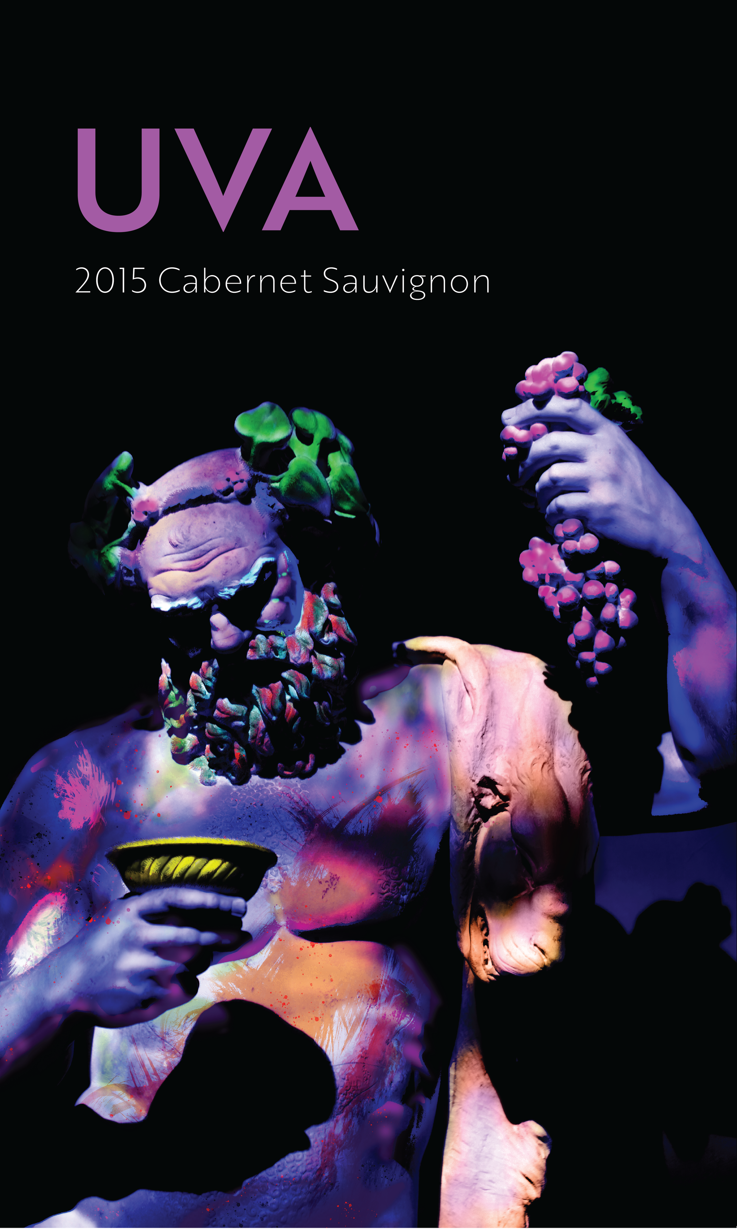
The name initially chosen to begin this journey was UVA (the Italian word for grape) because it was straightforward and could be used to create a simple, sleek design. In order to have the design stand out among the other brands I decided to incorporate a UV paint effect as a fun, exciting element to the bottle and packaging.
In my initial sketches, I tried to keep the designs simple and only use minimal elements but quickly found that the simple use of shapes and the wordmark did not have the effect I was hoping to achieve. So instead of just limiting the sketches to grape illustrations, I also tried adding other elements such as leaves and vines (#3, 8, 9, and 13) and some sketches using the Greek God Dionysus (#16, 17, and 19).
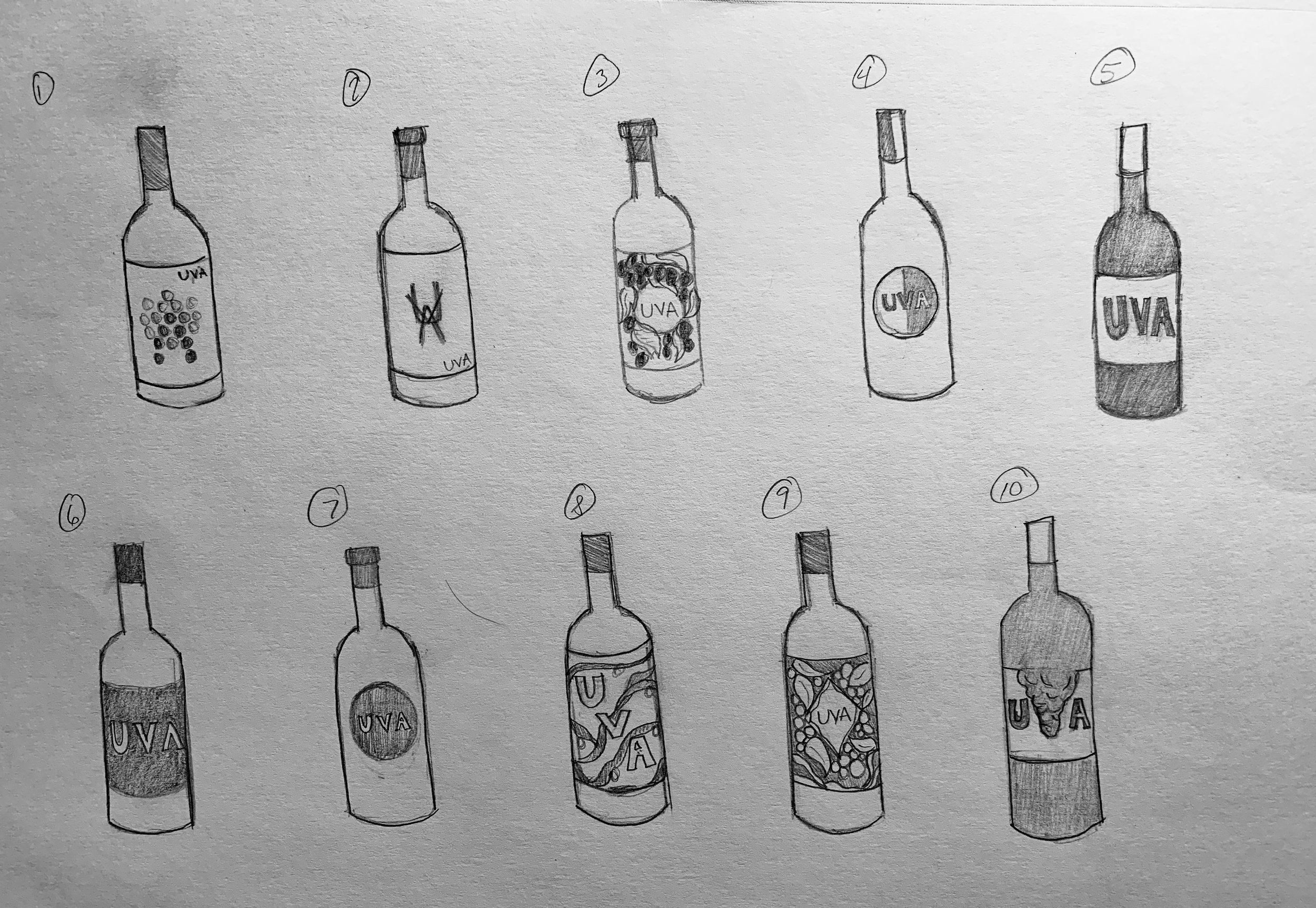

Digital Ideations
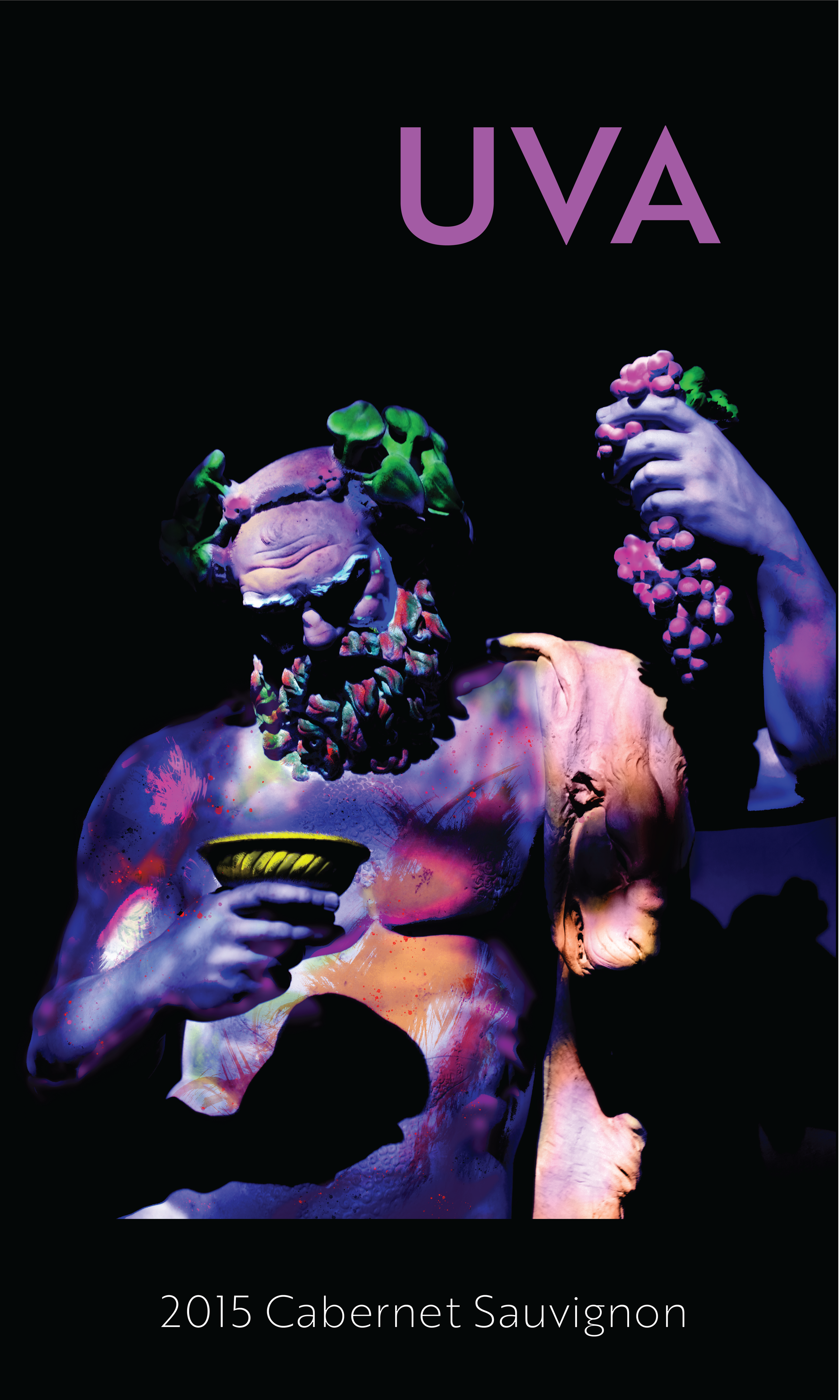
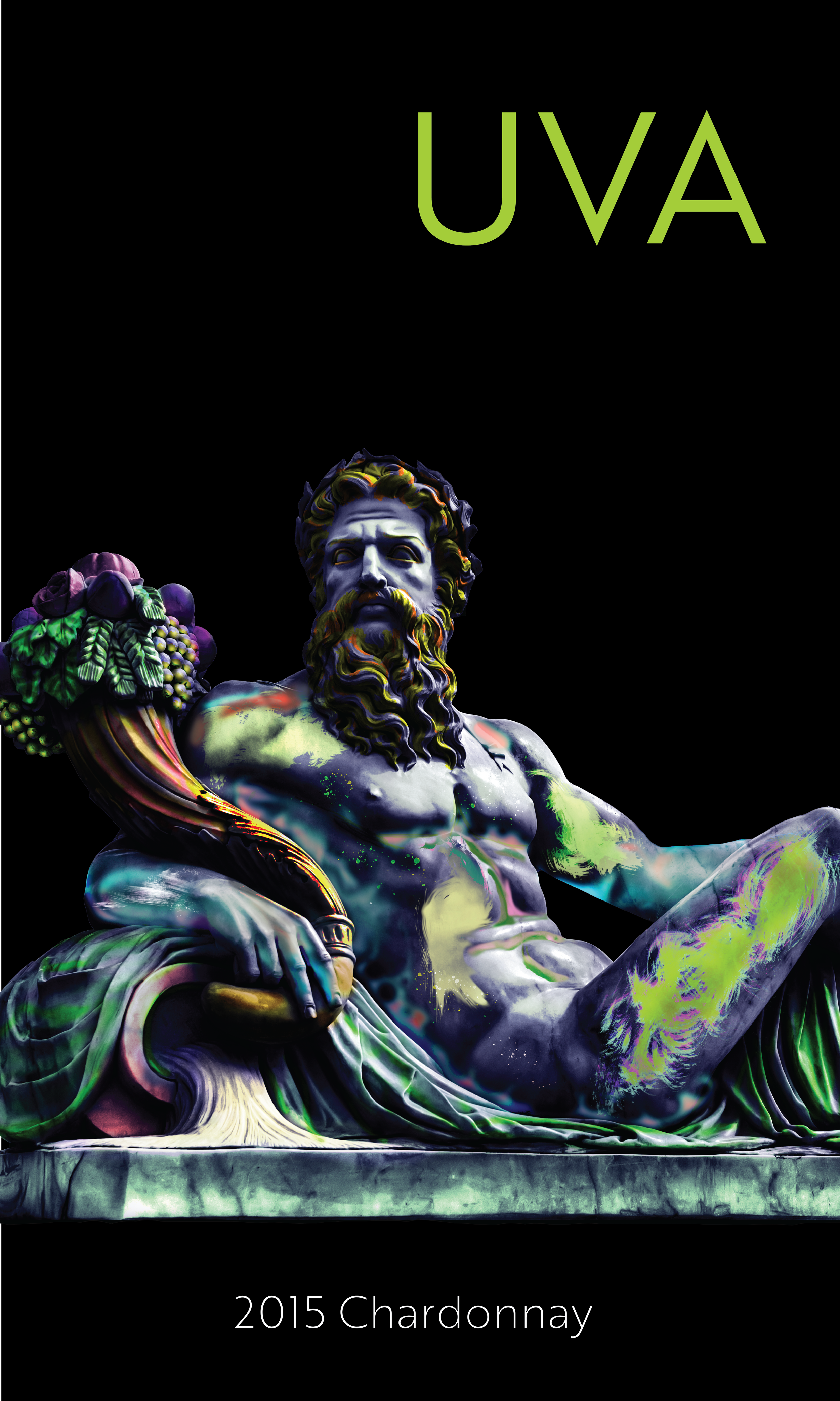
Moving forward I ended up using the sculptures of Dionysus for the main design due to his character having such an extensive backstory as not only the God of wine but also festivities. I felt his presence demanded more attention than a simple grape illustration could, especially since the plain design could easily be lost among the plethora of wines shelved in stores.
Next, I took two different Dionysus statues and edited them using photoshop to create a UV effect using layers, paintbrushes, and layer filters. I then applied this new knowledge to paint the two different statues different colors to reflect the two different flavors of white and red wine.
For the Chardonnay, I painted the sculpture to reflect lighter colors such as soft greens, bronze, purples, reds, and aqua colors. Meanwhile, the Cabernet Sauvignon uses darker shades of green, gold, purple, red, and blue.
Refinement
-
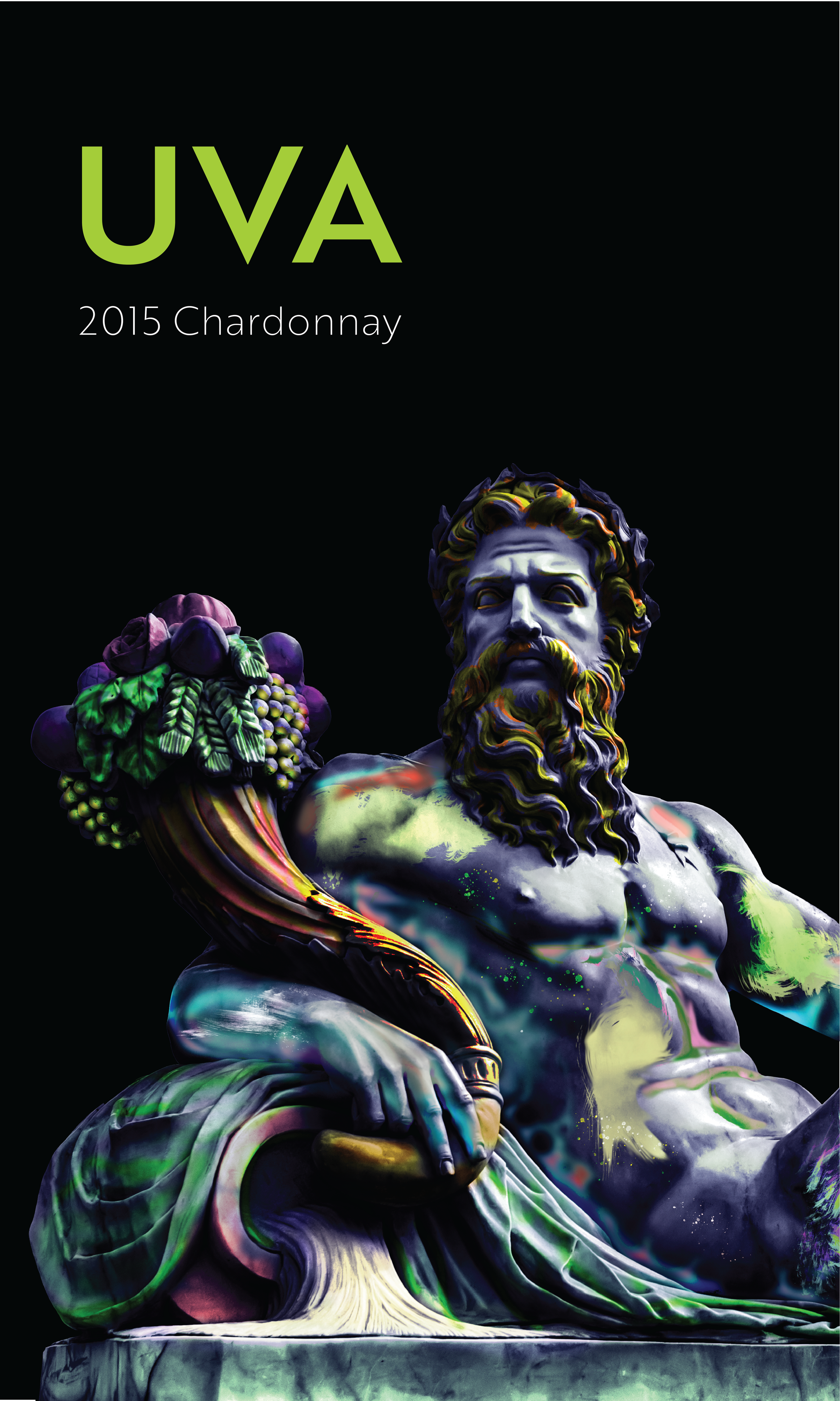
It came to my attention during a review that the name UVA did not fall in line with the sculptures and that it could be adjusted to better represent Dionysus’s character. After conducting more research on the Greek God, I discovered before he was known as Dionysus, he went by the lesser-known name, Zagreus.
-
The final version is enhanced only to show a portion of the statue to help portray the God as otherworldly and enormous in splendor. The title adjustments include a darker drop shadow against the white text to help it pop against the colorful statue. The wordmark also uses a new decorative font that closely resembles the Greek alphabet rather than a San Serif in order to maintain the theme.
