
-
Art enthusiasts interested in expanding their knowledge of Renaissance artists.
-
To apply our knowledge of effective layout design to create a book on our topic of choice. We would then need to develop and determine what images, fonts, colors, and grid system would be appropriate for the context. The hierarchy of each element should be clean and effectively guide the reader along without feeling too cluttered.
-
I analyzed art history books, National Geographic magazines, and other historical books for reference on how to successfully lay out a lot of information paired with images.

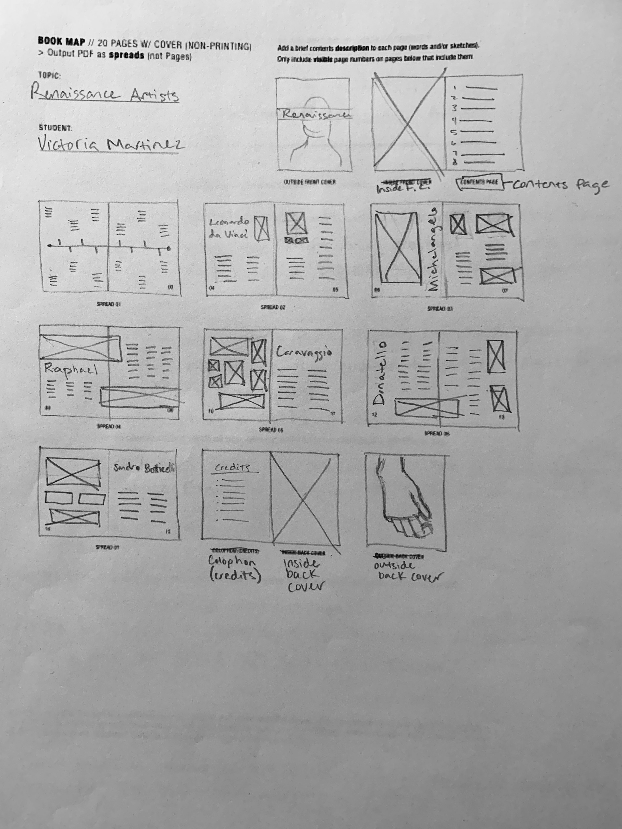
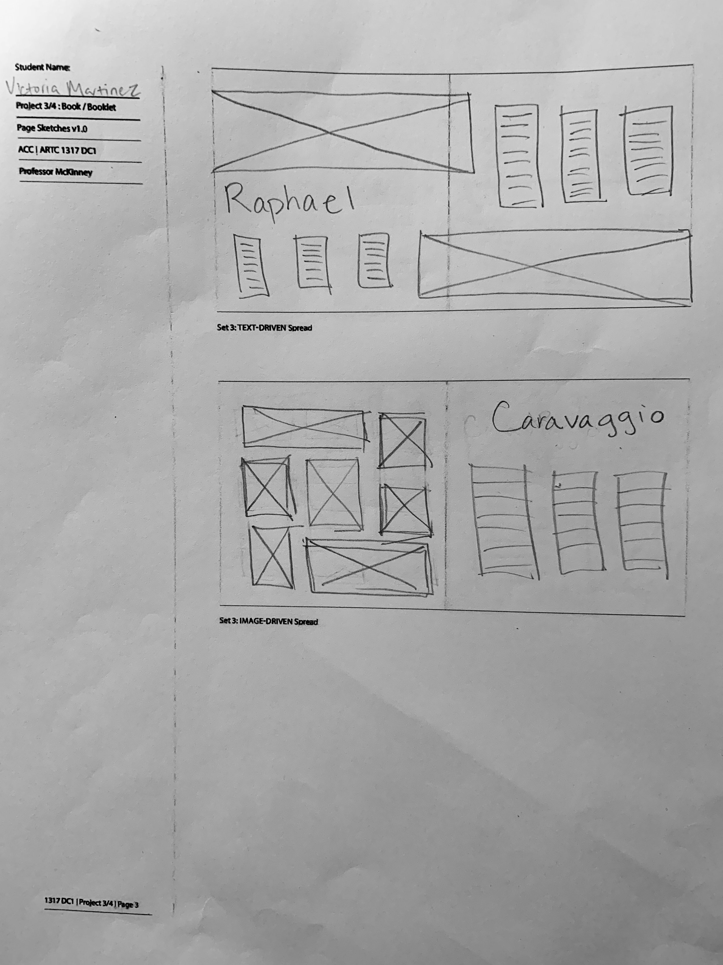
Sketches
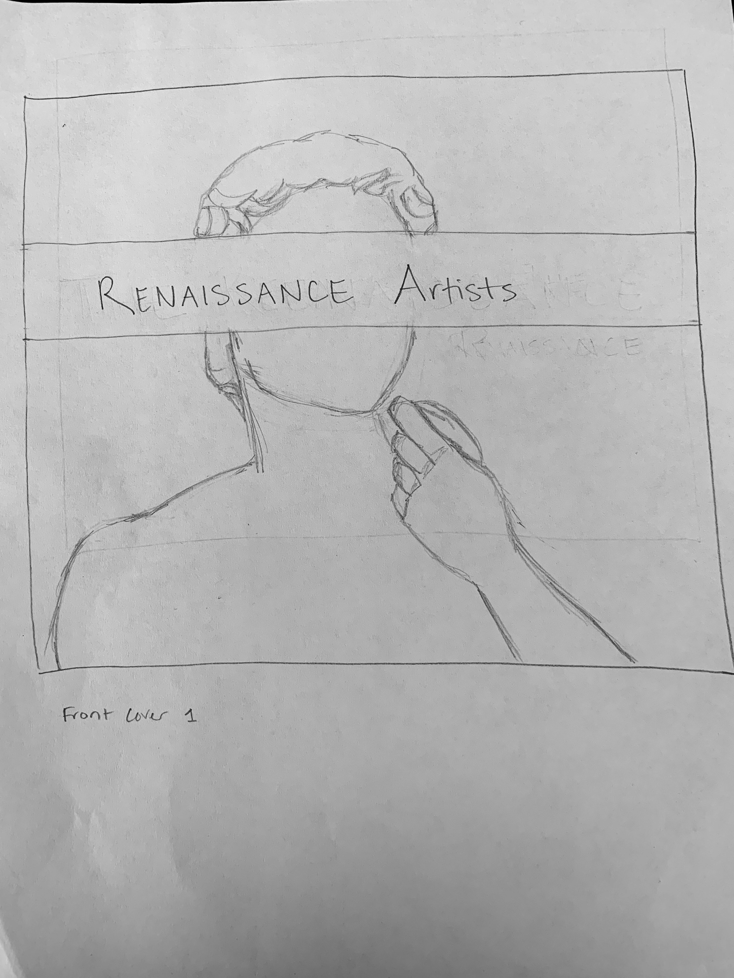
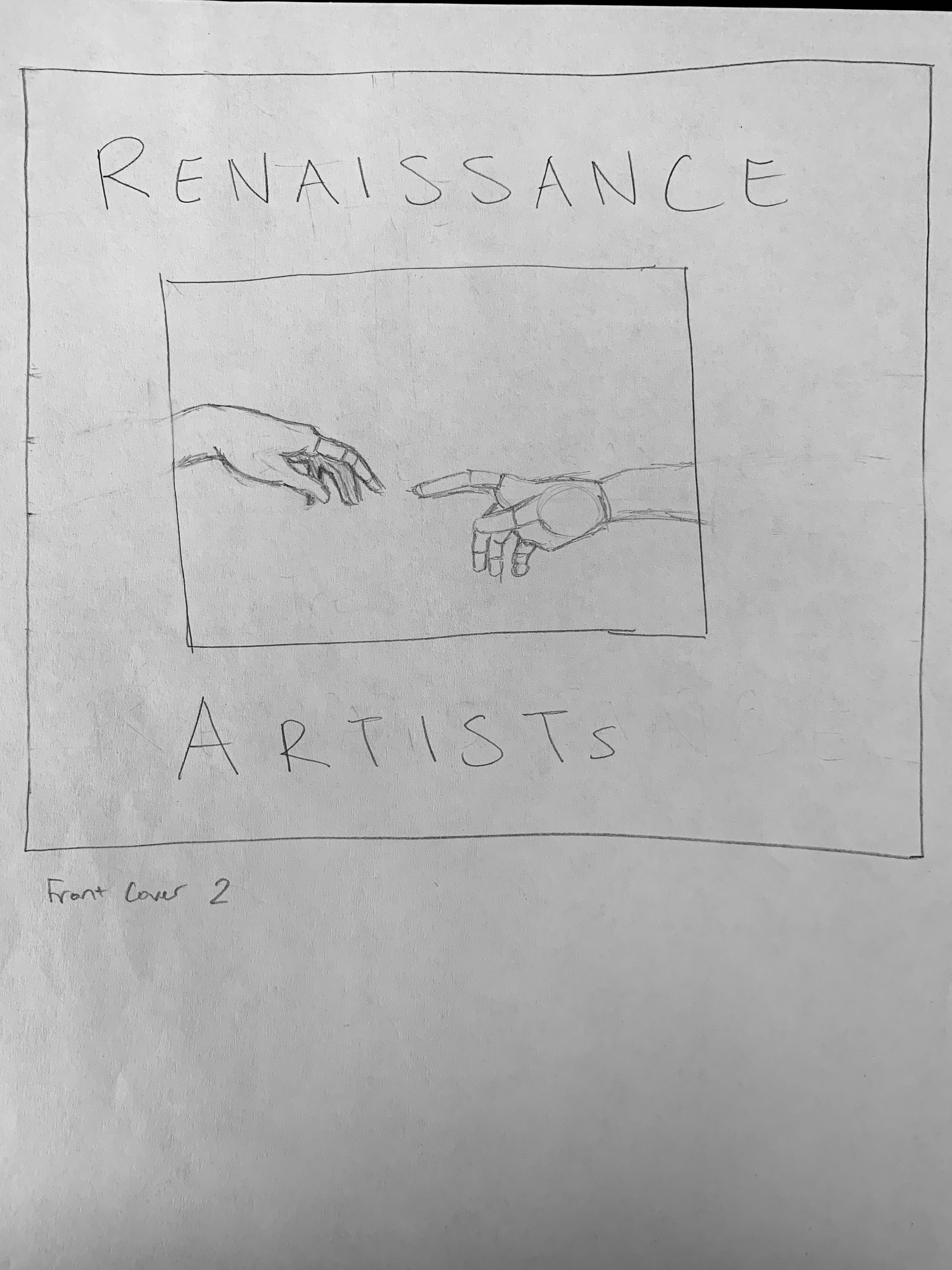
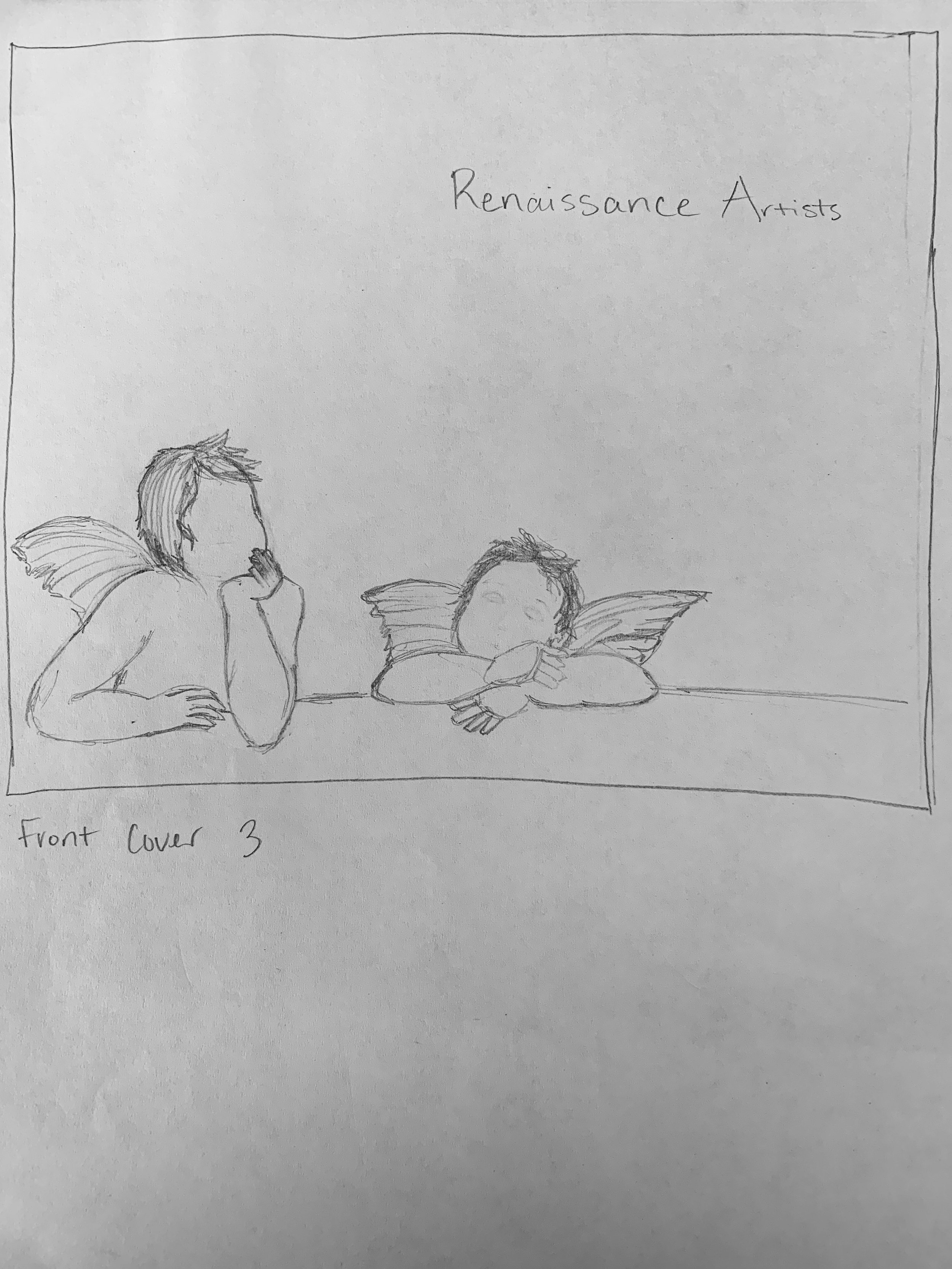
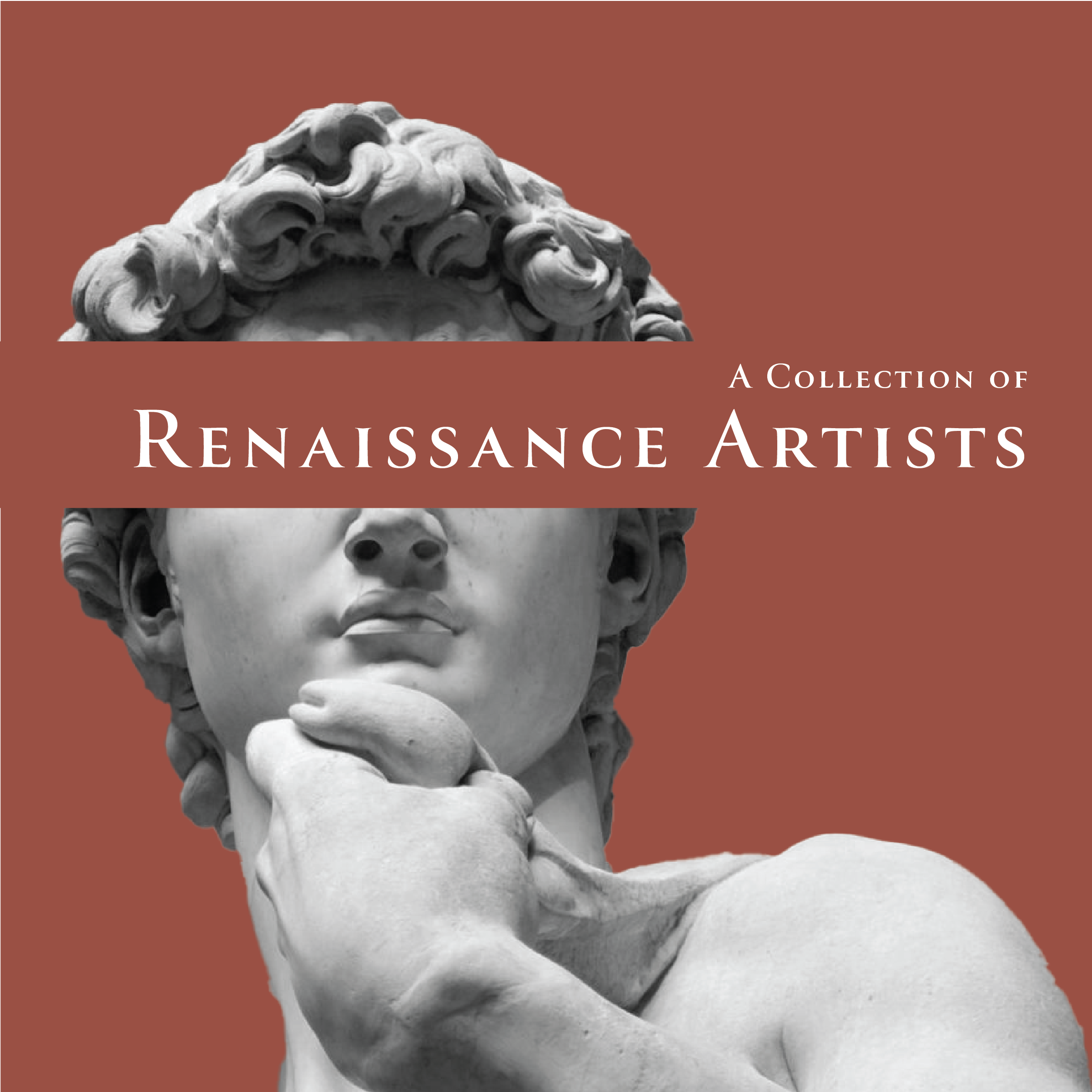
the initial ideas for the cover sketches were to use close-up images or framed sections of notable Renaissance pieces such as the Cherubs from the Sistine Madonna by Raphael and Michelangelo’s statue of David or his Creation of Adam painting from the Sistine Chapel.
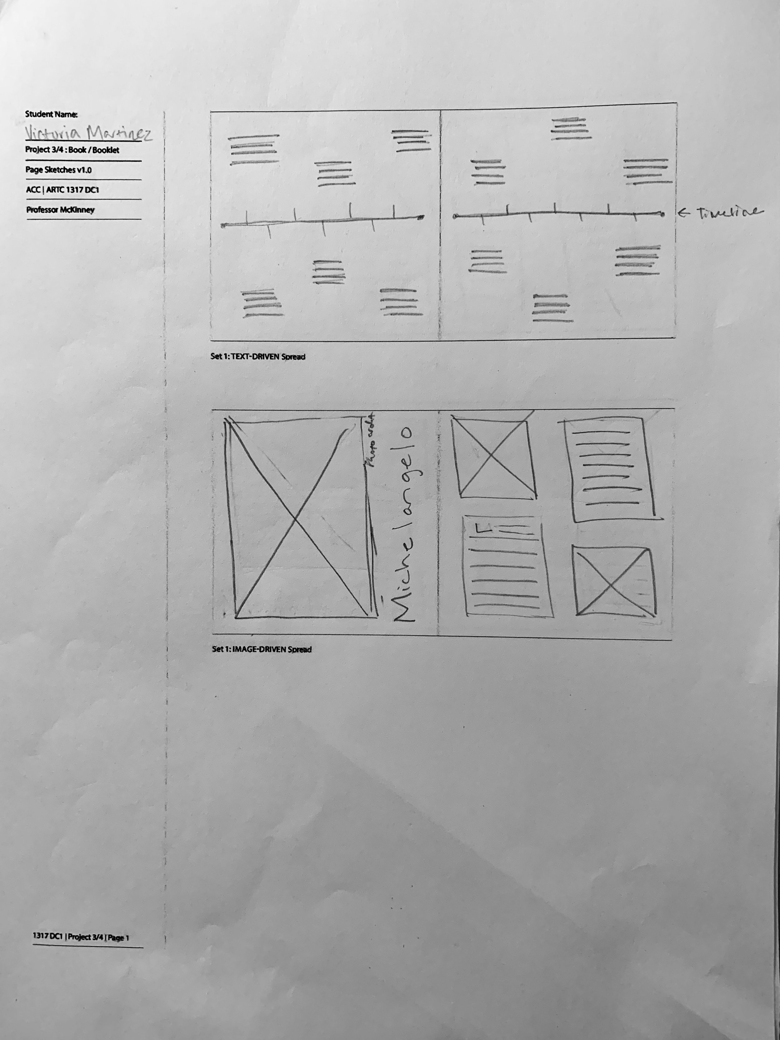
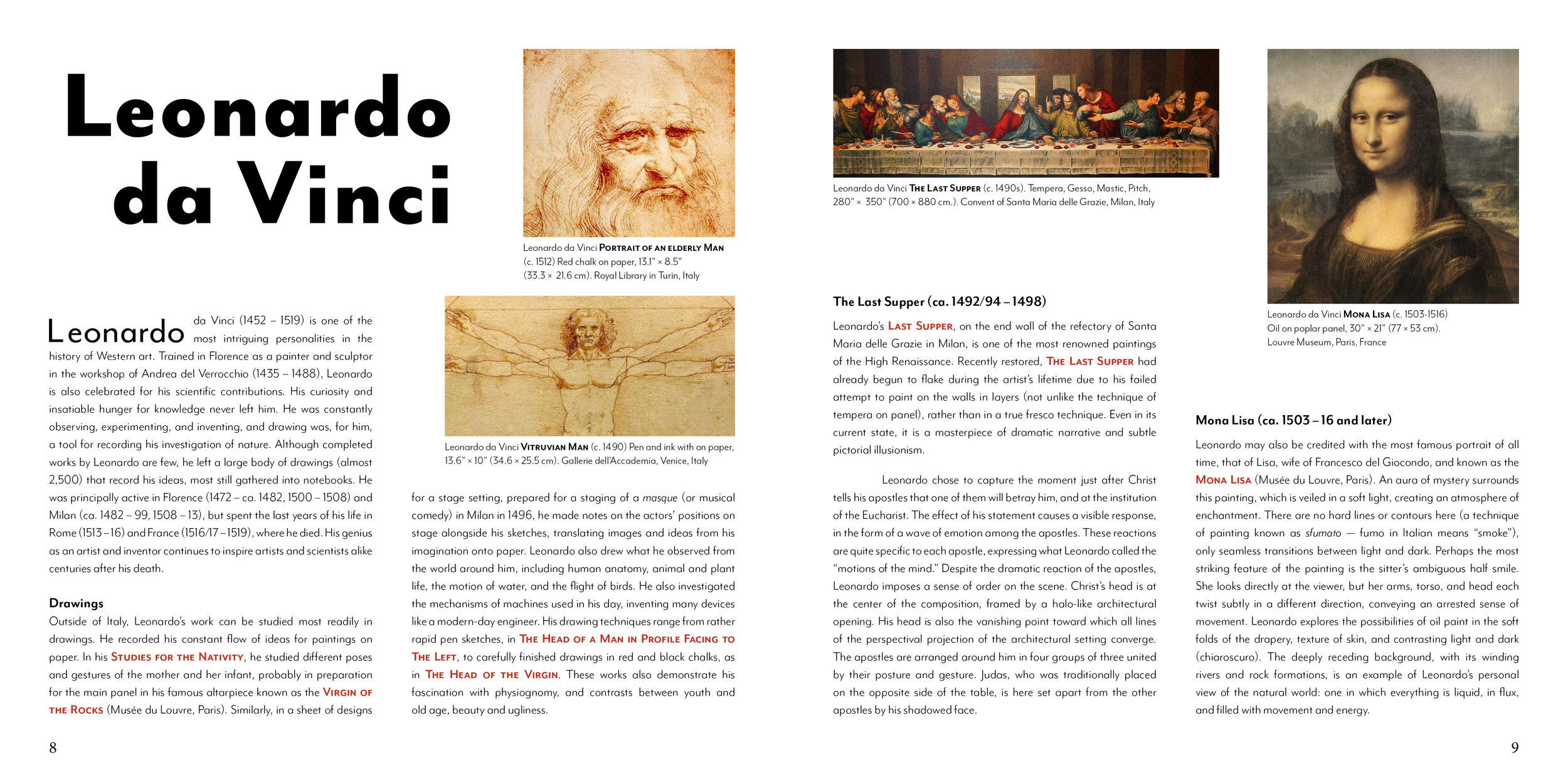
Meanwhile, the book map would alternate articles of each artist to balance the amount of information read provided by the historical papers and scholarly essays. The images also alternate between having some pages filled with photos of artwork or having the photos organized around the text.

Digital Ideations
Moving forward, I went ahead with creating each version of the cover wireframes in InDesign to determine which design was the most effective in alluding to the magnificence of the Renaissance. Each edition was paired against different typefaces to explore which styles fit within the structure without juxtaposing the image.
The layout also went through quite a few changes during the move to the computer. A few significant differences were altering the timeline found at the beginning of the book because the original design appears too cluttered with information, the addition of pull quotes, and additional spread featuring Michelangelo’s Creation of Adam mural featured in the Sistine Chapel in Italy.


Refinement
-
Moving forward the cover chosen for the book features Michelangelo's statue of David paired the Canto Pen typeface. This serif was selected due to its classical appearance and to use the serifs to mimic roman arches.
In initial version of the cover, there is an added tagline aligned just above the word artists to have the title appear to be part of the sculpture that is slowly being pullout out of the face. Alluding to the reader taking away information from the book.
However, upon review, the added weight created by stacking the two elements made the alignment between the sculpture and title feel awkward and tight between the figure and the edge of the canvas.
By moving the tagline to the top of the canvas with the title center-aligned created a visual triangle to focus the viewer’s’ attention on the face of the sculpture.
-
During the refinement phase I had the unique opportunity to gather guidance from professionals who were kind enough to take the time to provide feedback. Following this feedback, one of the designers encouraged me to revisit the spreads to adjust size the section titles to better harmonize with the grid system and help the design feel less overwhelming with the amount of information provided.

