
-
Young adults ages 18 and up who are avid fans of streetwear-style clothing. They want to represent their respective aesthetic through clothing sporting designs from young and upcoming street artists to seasoned artists.
-
Brand logos (variations)
Stationaries
Brand merch (hats, t-shirts, hoodies)
-
To develop a new brand identity and standards that reflect its core values and personality. The identity must include an effective brandmark (logo) that is adaptable and can transfer across different media and a fully developed guideline for the logo, typography, and colors.
-
During the discovery phase, I studied other streetwear clothing brands, including Nike and The Hundreds, to better understand what makes their design successful. For each brand, I noticed that they had created a personality for themselves that found them each falling into a different genre of buyers. Nike is known for its sports attire, and The Hundreds is a community-founded streetwear brand reminiscent of the 90s generation.
Determined to make a brand that could become the face of street art, I decided to check out different street artists and look through murals to determine how the brand's style could capture the creativity, vibrance, and overall daring attitude.

Sketches
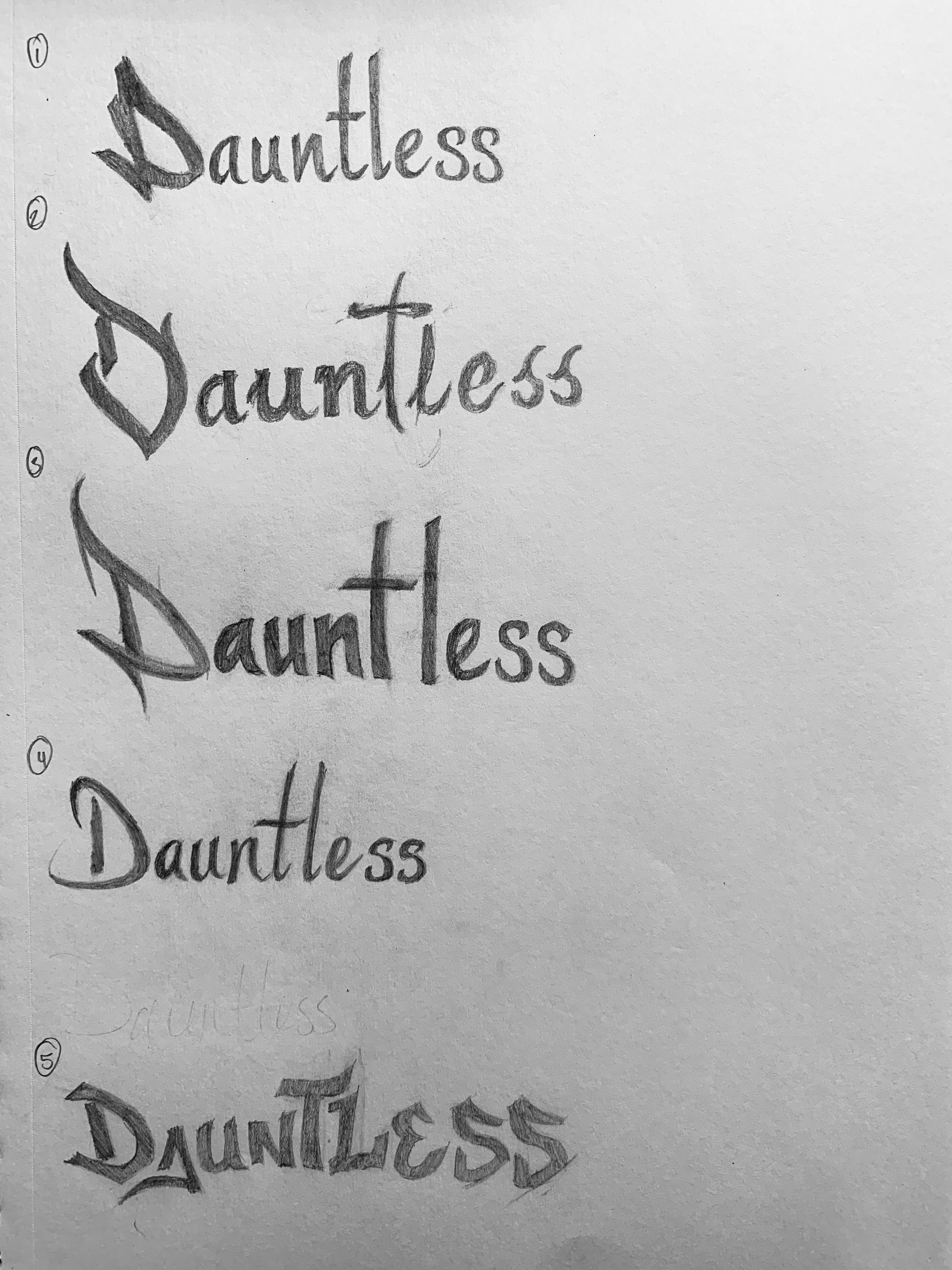
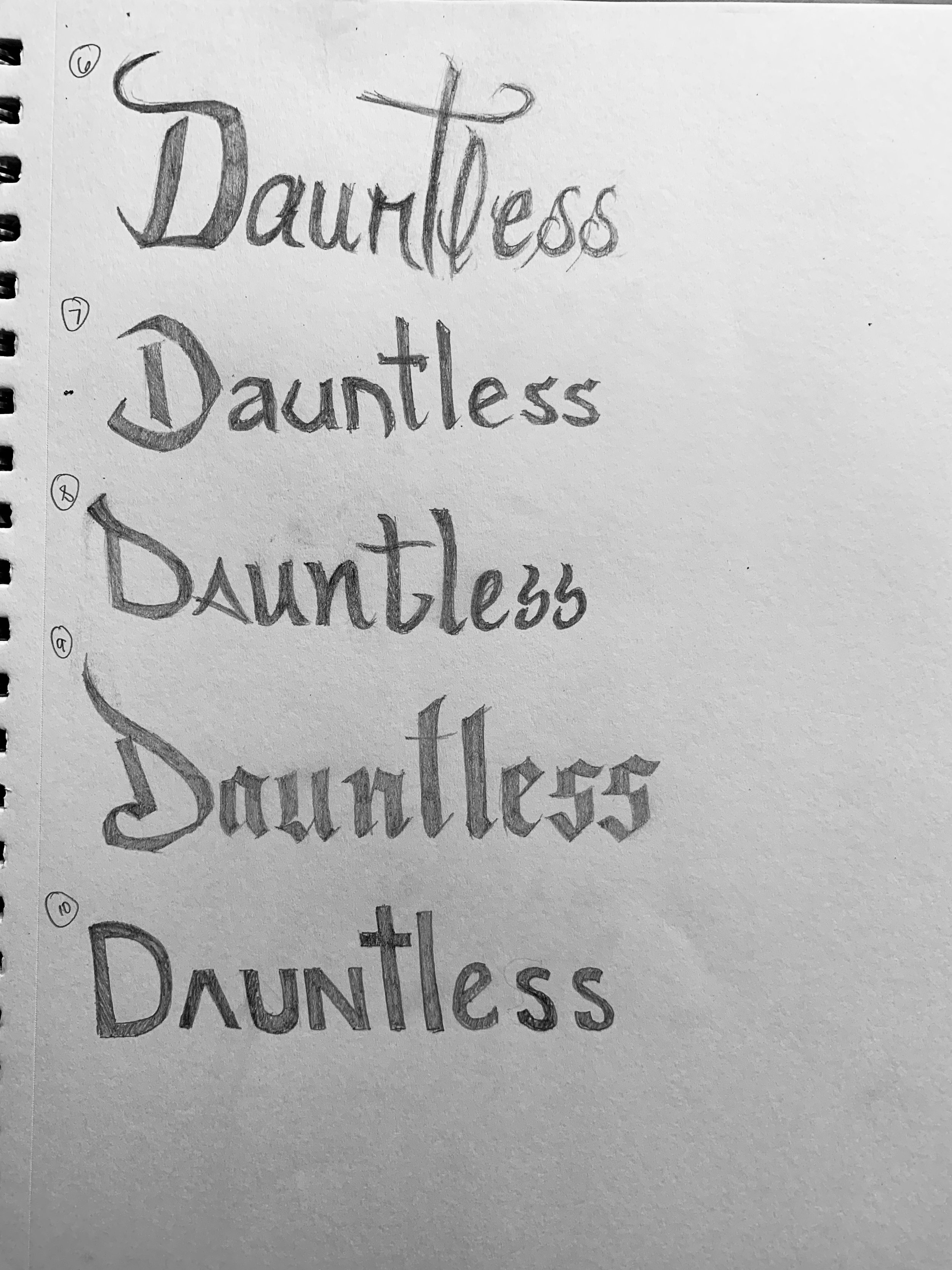
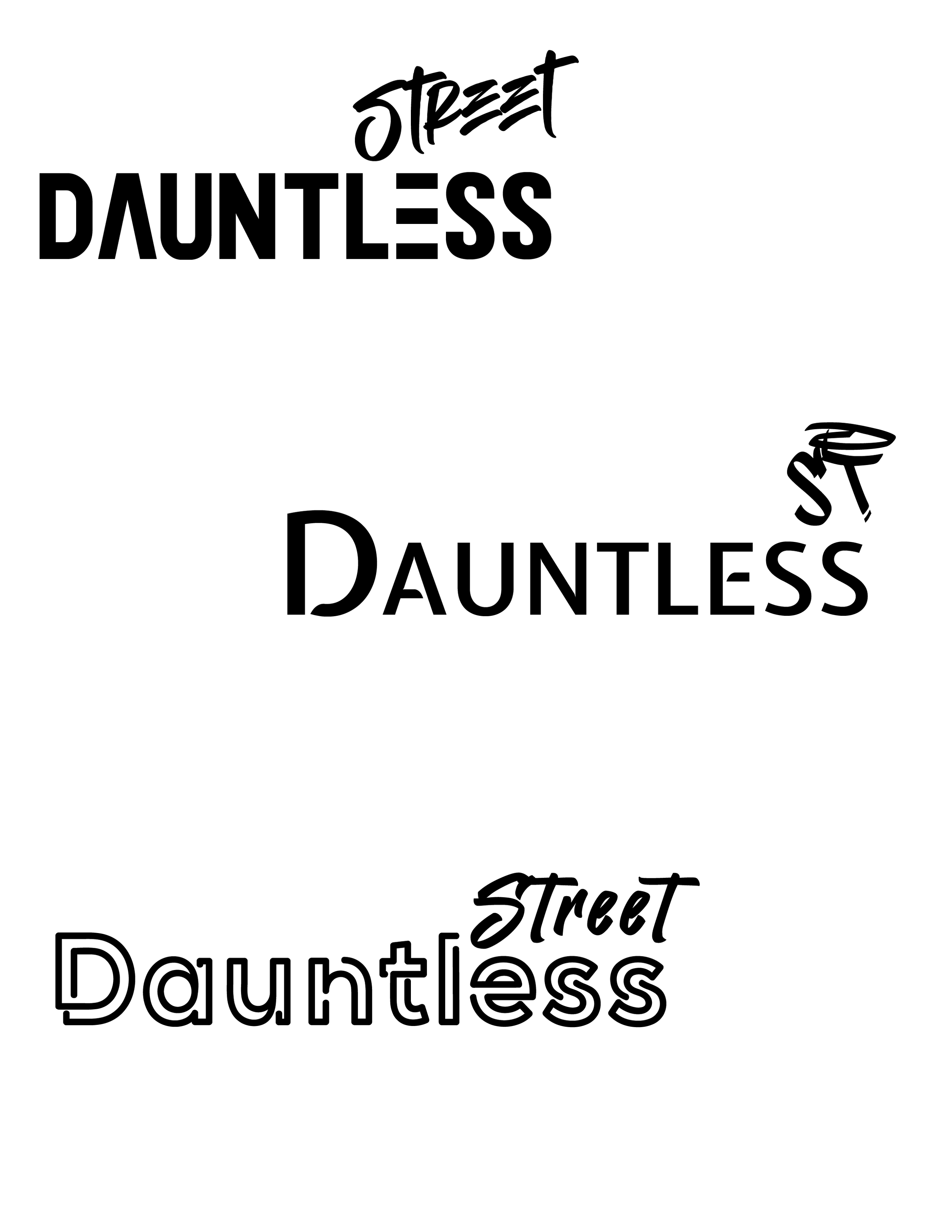
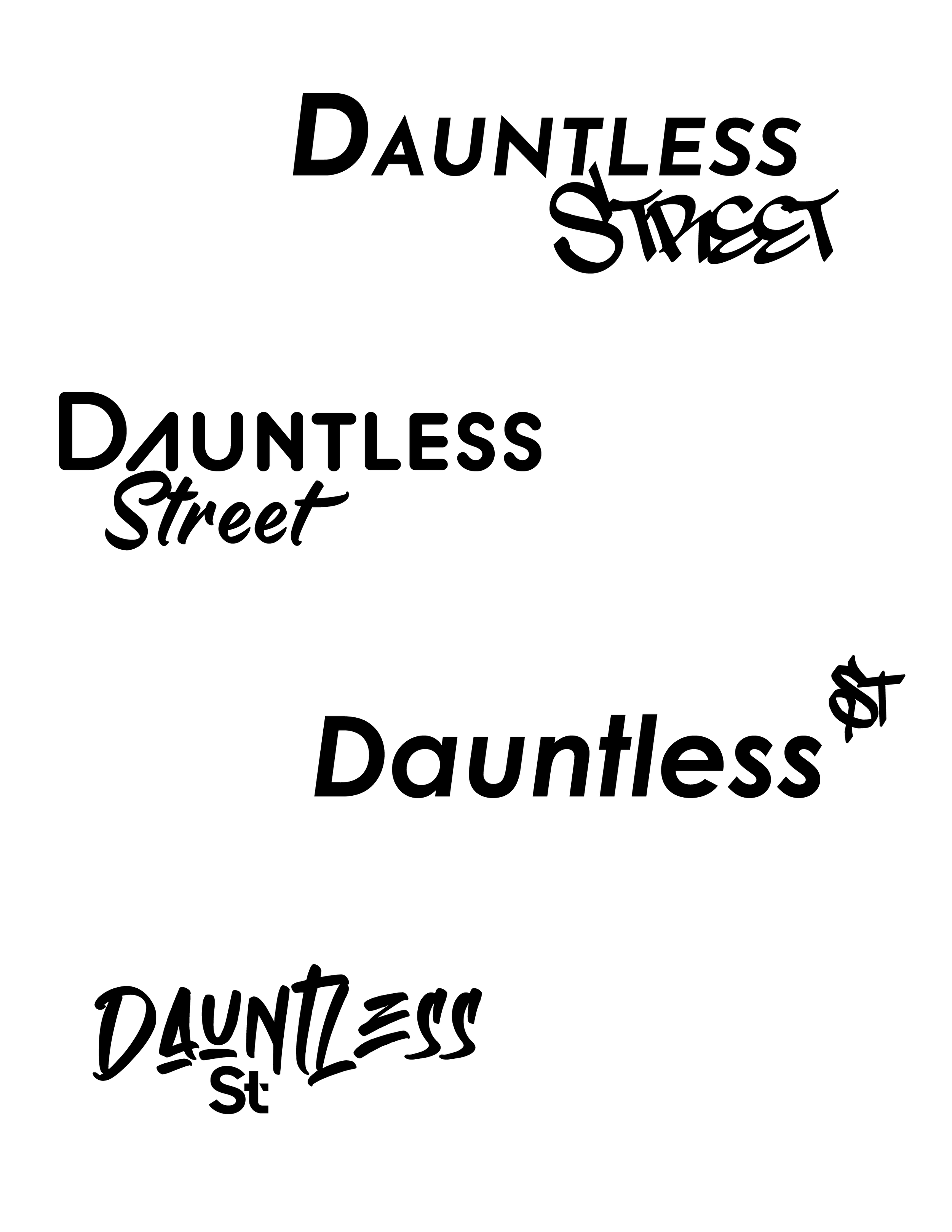
I explored various styles of word marks and monograms inspired by the graffiti typeface that reflects street artists' bold, creative, and edgy personalities. It was important that while these marks should follow the style, they still needed to be clear and legible for the viewers to understand the name without too much complexity.
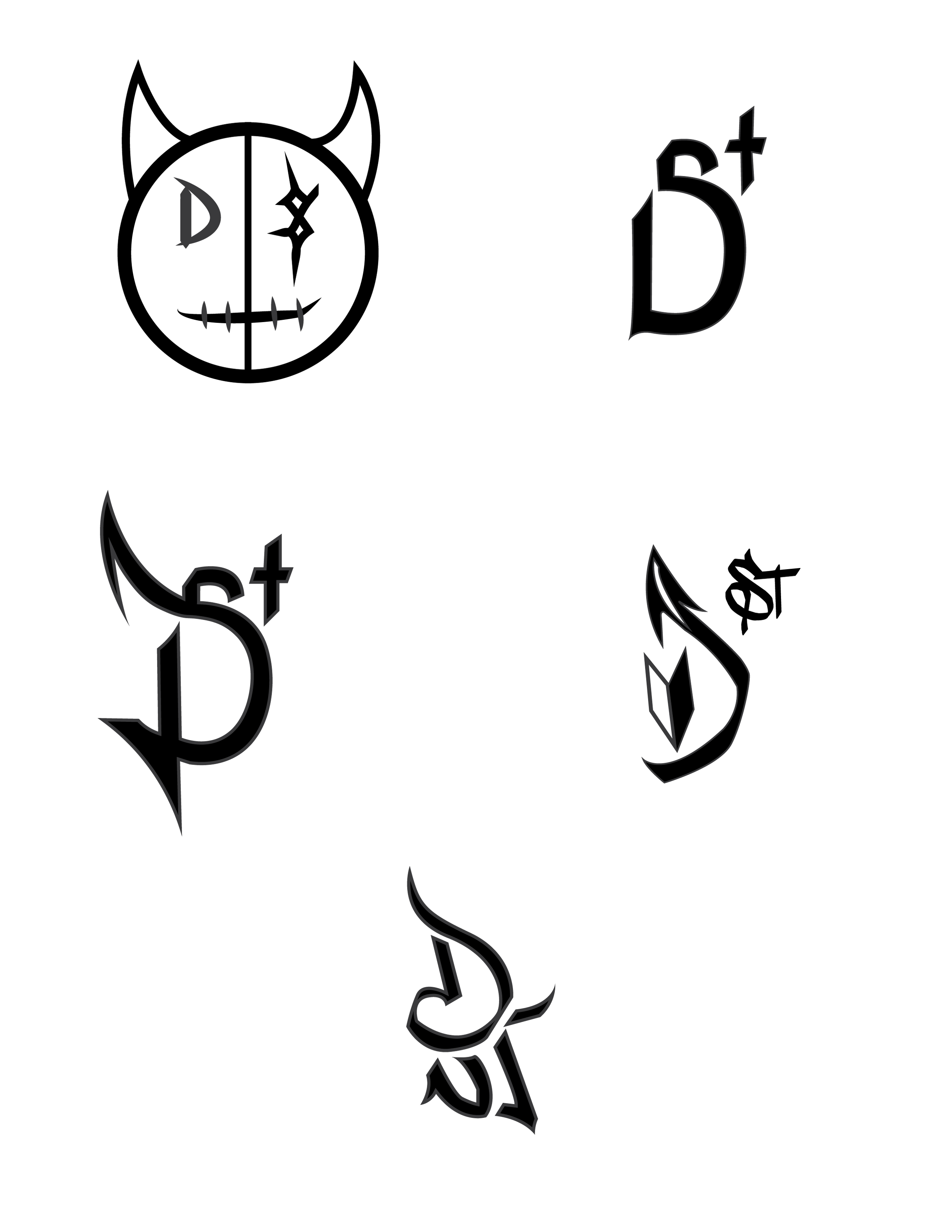
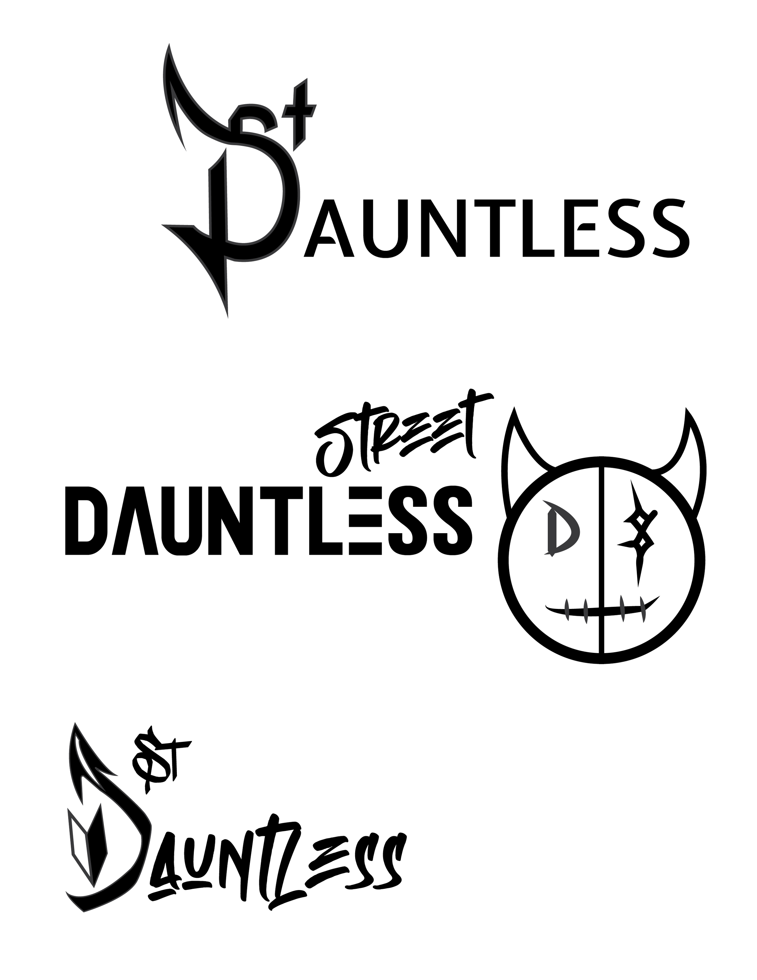
Next, I tried different pictorial elements that included a sword to demonstrate fearlessness, a devil character to represent the adventurous personality of artists, and street signs with Dauntless written either on the street signs or below in the graffiti style, much like what would be found on tagged buildings.


Digital Ideations
With the help of feedback provided by my classmates, it was much easier to decide which five elements from the sketching phase would move forward to the digital rounds. From these elements, I tried pairing them with different typefaces to determine which paired well together and with the devil character.
Refinement
-
The primary wordmark is made using the typeface Empires provided by Mlkwsn on Dafont. It is modified to be a unique rendition of the original using Illustrator to remove and relocate elements, creating a new wordmark.
-
After choosing the devil character to move forward as the primary logo, the illustration would go through a few changes including smoothing out the edges of the right eye and altering the left eye to be an uppercase D from the font used in the primary wordmark.
-
The primary lockup of the Dauntless logo consists of the primary logo aligned vertically with the wordmark just below it. The logo is adaptable and can be transitioned to black, white, and different colors when placed over a colored background.
The secondary lockup alters the original logo to be horizontally aligned and alternated depending on the circumstance and usage of the logo. This lockup would be ideal for clothing tags and merch (shirts, stickers, hats, etc.)

Primary lockup wordmark + logo

Secondary lockup